These plants were backlit by the golden light this evening, as I enjoyed a stroll round Consall woods. As a bit of a poll to satisfy an editing pondering I've been having of late, I'd be interested whether people prefer the one with less contrast, or the second one with greater contrast (I won't say at present which was more representative).

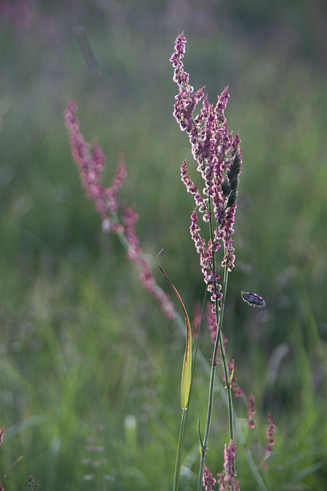 168mm, 1/100s, f/5.6, ISO 200
I prefer the one on the right :o)
ReplyDeleteI prefer the one on the right too, though my guess would be that left is more representative...
ReplyDeleteI much prefer the one on the left. The one on the right looks a bit unnatural.
ReplyDeleteCheers. I edited a different picture in a similar way today and with it being a more complex photo (more in it), I realised the version with the stronger contrast is quite unnatural, like you say. Less is more!
ReplyDeleteThe reason I asked is because lately I've been looking at various photographs on the web that are quite soft in terms of colour and light that look really lovely, and realised that maybe I over-process mine in terms of contrast and definition. I did a little automatic adjustment in raw on this photo as I usually do to spread the histogram out, then in photoshop I threw in a levels layer and changed the blending mode to 'overlay', also a common edit for me to make. I dragged the opacity quite a long way down to minimise the effect, to 20% and liked the way it looked - that is the paler of the two photos here, more subtle. If I put the opacity any higher it looked wrong, but at 80% suddenly the vividness of the light round the edge of the flower jumped out, so I saved it as a different version. However, I do feel this makes the background rather distracting, as it's greener and bolder. The background grass wasn't that green in reality.